![]()
![]()
Overview
The Portfolio Management dashboard is organized around GKFF’s Program Pillars, grouped under broader Focus Areas. Each horizontal module on the page represents a Focus Area or an overall portfolio summary. From this view, users can review high-level investment and performance signals, then expand sections to explore pillar-level KPIs and trends.
This page covers:
- Focus Area Summary
- Exploring a Focus Area
- Exploring a Program Pillar
- Exploring a KPI
- How to Use This View
Focus Area Summary
Each Focus Area Summary provides an at-a-glance view of how investments and impact indicators are performing across a major area of GKFF’s work.
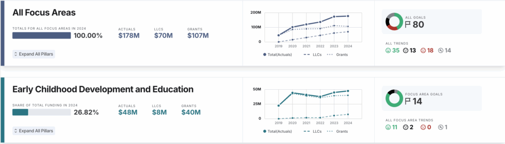
When viewing a Focus Area Summary, you’ll see:
- Investment Data: Total investment for the focus area shown as a share of the overall portfolio.
- Spend Trends: Line graph showing funding over time, broken out by grants and LLCs.
- Allocation Bar: The percentage of total portfolio investment allocated to this focus area, relative to others.
- KPI Summary Donut Chart: A visual breakdown of Impact Goal KPIs trending favorably, neutrally, or unfavorably, along with a count of total unique KPIs associated with the focus area.
- Trend Icons
- ↑ ↓ Green = Trending favorably
- – Black = Trending neutrally
- ↑ ↓ Red = Trending unfavorably
- 🔧 Gray = Data coming soon
Configuration Notes
- Duplicate KPIs: If the same KPI appears across multiple pillars within a focus area, it is counted only once in the focus area summary.
- KPI Trend Calculation: The KPI Summary Donut Chart reflects the year-over-year (YoY) change for each Impact Goal KPI, categorized as trending favorably, neutrally, or unfavorably based on its defined performance logic.
Exploring a Focus Area
Click “Expand All Pillars” to reveal the Program Pillars within a Focus Area. Once expanded, each pillar displays its associated Impact Goal KPIs, including trend indicators and historical performance comparisons.
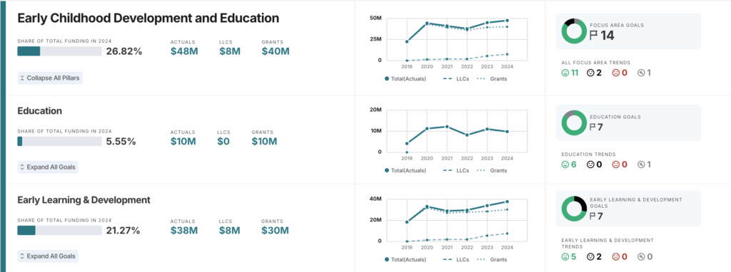
When a Focus Area is expanded, you can:
- View pillar-level investment totals and spending trends
- See how Impact Goal KPIs are grouped and summarized by pillar
- Compare KPI performance signals across pillars within the same Focus Area
This expanded view helps users move from an executive snapshot to a more targeted understanding of where progress is concentrated within a Focus Area and where further review may be needed.
Exploring a Program Pillar
Click “Expand All Goals” to reveal the Program Pillars within a Focus Area. Once expanded, each pillar displays its associated Impact Goal KPIs, including trend indicators and historical performance comparisons.
When a pillar is expanded:
- The segment used to calculate the KPI Summary Donut Chart is visually emphasized.
- The column corresponding to that segment is highlighted in gray.
- The reference segment name is flagged.
This visual cue helps users quickly understand which segment’s data is informing the KPI summary, especially when comparing results across multiple segments.
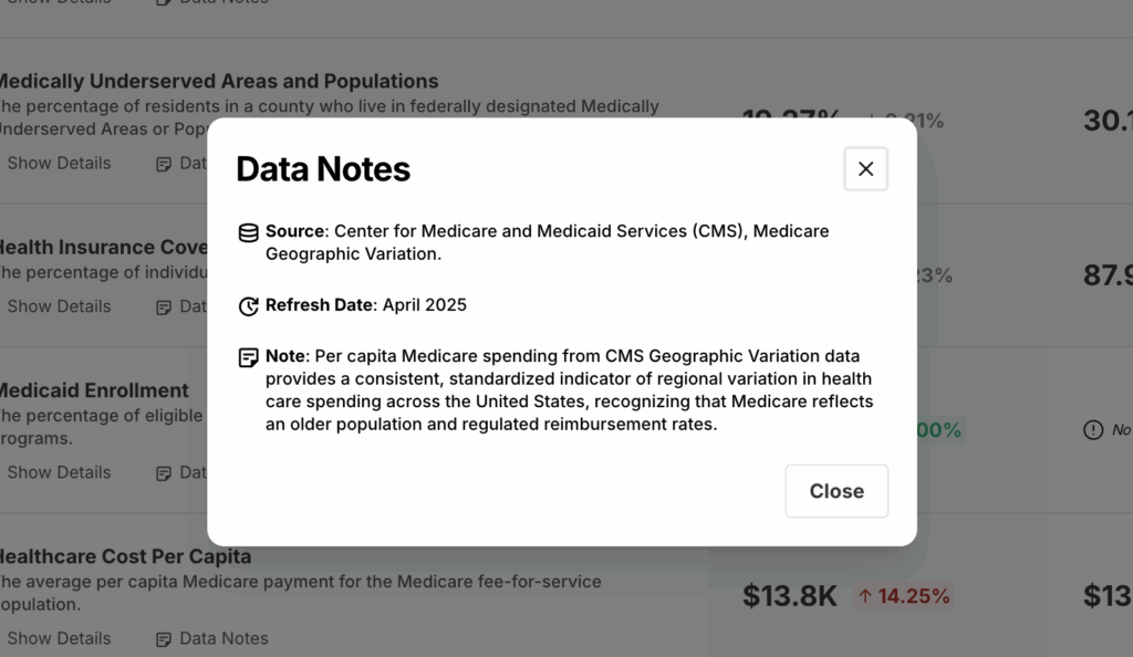
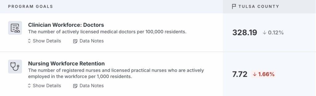
Viewing Data Notes
For each Impact Goal KPI, Data Notes are available to provide additional context about the underlying data.
By clicking “Data Notes” located under the KPI name and description, you can view:
- Source: The organization or system from which the data is derived
- Refresh Date: The most recent date the data was updated
- Notes: Important context about the dataset, including known limitations, suppression rules, or reporting considerations
These details help ensure transparency and support accurate interpretation of KPI trends and comparisons.
Exploring a KPI
Clicking into an individual KPI reveals detailed historical and comparative views that help you understand both long-term patterns and recent movement.
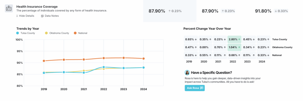
Trends by Year
The Trends by Year line graph shows how the KPI has changed over time across geographies.
- Lines represent geographies such as Tulsa County, Oklahoma County, and the U.S., allowing side-by-side comparison.
- Each data point reflects the reported value for that year, based on the most recently available data.
- This view helps you identify:
- Long-term progress or decline
- Divergence or convergence between Tulsa and peer benchmarks
- Periods of disruption, recovery, or acceleration
Use this chart to understand direction and context over time, rather than focusing on a single year’s result.
Percent Change Year Over Year
The Percent Change Year Over Year grid shows how the KPI has changed from one year to the next and how that change is interpreted based on the KPI’s defined performance logic.
- Each cell displays the percentage change compared to the prior year, by geography.
- Color indicators reflect performance sentiment, not just direction:
- Green indicates the change is trending favorably
- Black indicates the change is neutral
- Red indicates the change is trending unfavorably
- Gray / N/A indicates insufficient data to calculate a year-over-year comparison
- The sentiment shown here is the same logic used to calculate the KPI Summary Donut Chart at the pillar and focus area levels.
Because sentiment is KPI-specific, an increase may be unfavorable for some metrics (e.g., rates of adverse outcomes), while a decrease may be favorable. This ensures year-over-year changes are interpreted in the proper context of each KPI’s goal.
Using These Views Together
Taken together, these two views help answer complementary questions:
- Trends by Year: How has this KPI evolved over time, and how does Tulsa compare to peers?
- Year Over Year Change: Where are we seeing recent momentum, stagnation, or reversal?
How to Use This View
This view helps teams move from observation to action by showing not just whether a KPI is changing, but whether that change reflects meaningful progress toward GKFF’s goals. By pairing trend direction with performance sentiment, users can quickly identify where conditions are improving, where progress is stalling, and where deeper attention may be needed.